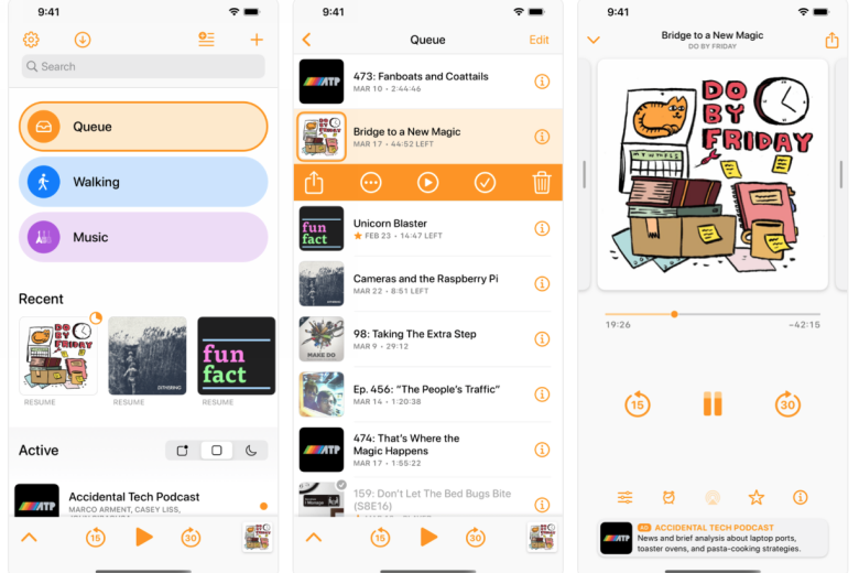
Despite the podcast onslaught from Apple, Spotify and more, the Overcast app remains one of the most popular places on iOS to collate and listen to all of your favourite content creators.
The functionality is great and supporting the one-man operation is a great way to stick it to the major firms like Spotify, who’re looking to monopolise access to the major podcasters.
Unfortunately, until now, the design of Marco Arment’s app has resembled an old RSS feed, rather than an ultra-modern listening portal suitable for 2022.
That all changes today, with a major update for the app, which adds some much-needed colour and exuberance. There’s a new focus on playlists, and podcast artwork within the “radically different” home screen and a more readable font (San Francisco Rounded). You’ll definitely notice the changes as soon as you open up the updated app for the first time.
Functionality has been boosted with drag-and-drop playlist re-ordering. There’s also a new Mark as Played feature, accessible as a checkmark or a left-swipe action, as well as a way to view all starred episodes. It’s also possible to create playlists for starred, downloaded and episodes in progress.
“Playlists now have strong visual identities for nicer and easier navigation,” Arment writes on his blog. “Each playlist has a customizable color, and a custom icon can be selected from over 3,000 SF Symbols to match modern iOS design and the other icons within Overcast.
“Recently played and newly published episodes can now be displayed on the home screen for quick access, much like the widget and CarPlay experience. Podcasts can now be pinned to the top of the home-screen list and pinned podcasts can also be manually reordered with drag-and-drop.”
Arment says this is the first part of the grand redesign he’s been working on, and next up is the Now Playing screen.


